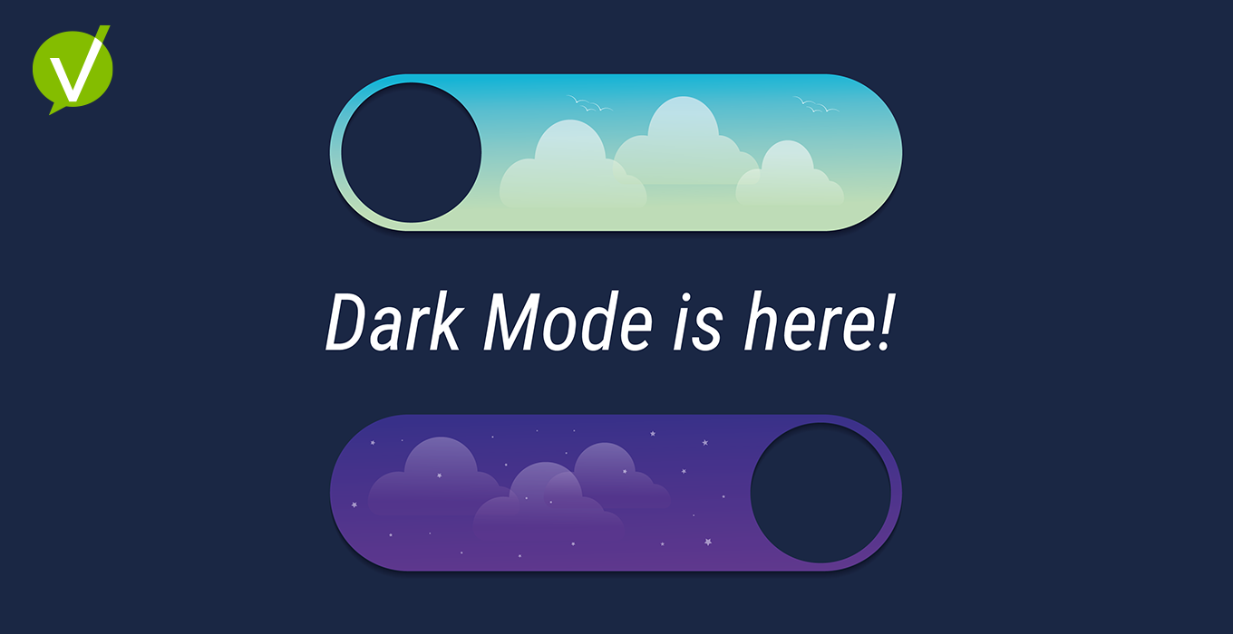
Dark vs. Light Mode for SaaS: What Actually Helps Users Get Work Done
Beyond the Aesthetic: Why This Debate Matters

Dark mode is everywhere. It looks premium, feels calmer at night, and on OLED screens, it can even save a bit of battery. But for service teams living in lists, forms, and knowledge articles all day, the real question isn’t “Which is better?”—it’s “Which is better, when, and for whom?”
At Vivantio, our design team didn’t set out to follow a trend. We set out to solve a problem: how do global service teams maintain clarity, comfort, and performance across any lighting condition?
That question turned a design decision into an operational one.
The Rise of Dark Mode — and the Split Reality
Since Apple and Google introduced system-wide dark themes in 2019, dark mode has gone mainstream. It’s in Slack, Gmail, GitHub, and nearly every SaaS tool. But that adoption hides a more complex truth.
Research from Nielsen Norman Group, Android Authority, and Forbes points to a mixed bag:
- Battery life: noticeable savings—but mainly on OLED screens at higher brightness levels.
- Eye comfort: improved in low light, not always in bright spaces.
- Readability: users with normal or corrected vision typically read faster in light mode; those with cataracts or cloudy ocular media often prefer dark.
In other words, dark mode isn’t universally better. It’s contextual—just like the lighting in your workspace.
“Dark mode isn’t a trend—it’s a reflection of how people really work.”
The Science Behind Comfort and Clarity
The human eye wasn’t designed for 10-hour screen days. What we perceive as “eye strain” often has less to do with color palettes and more to do with focus duration and lighting contrast.
Here’s what the data says:
- Blue-light myths: Blue light exposure from screens is minimal compared to daylight. Fatigue often stems from extended visual focus, not wavelength.
- Contrast polarity: Light backgrounds (dark text on light) yield higher reading speed and accuracy for most users.
- Pupil response: In dark environments, pupils dilate, making bright text on dark backgrounds appear to bleed—known as halation.
Still, dark interfaces can reduce glare and visual noise—especially valuable for support teams working overnight shifts or in dim network operation centers.
“Comfort and focus aren’t universal—they’re situational.”
Context Is Everything: SaaS Workflows in the Real World
Unlike consumer apps, SaaS platforms operate across every lighting condition imaginable: open offices, home workstations, mobile dashboards, and after-hours triage sessions.
That’s why context—not preference—should drive design decisions.
- Support engineers working through late-night incidents need reduced glare and calmer contrast.
- Analysts working with dense tables in bright offices need sharper readability.
- Executives scanning dashboards on mobile expect consistency across light conditions.
A well-implemented dual theme doesn’t just look right—it performs right. It becomes a subtle productivity safeguard, helping users work longer, smarter, and more comfortably.
“For SaaS, light and dark aren’t preferences—they’re performance modes.”
Customer Accessibility First, Always
Accessibility isn’t an afterthought—it’s the baseline.
According to the Nielsen Norman Group, users with astigmatism often struggle with white text on black backgrounds due to haloing effects, while users with cataracts or other low-vision conditions sometimes read better in dark mode because the screen emits less total light.
Both experiences are valid—which is why choice is the most inclusive feature you can offer.
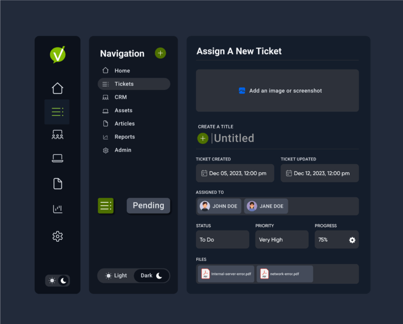
At Vivantio, our Dark Mode was tested for clarity, legibility, and WCAG compliance across both themes. Text, icons, and color states maintain parity—so no information is lost when a user switches from light to dark.
“True accessibility means every user sees clearly—whichever mode they choose.”
Designing for Duality: How to Get It Right
Supporting both themes isn’t about flipping colors. It’s about creating balance, consistency, and intention across systems.
Color & Contrast
- Maintain a minimum 4.5:1 contrast ratio for body text.
- Avoid pure black (#000) and white (#FFF); use deep charcoals and soft off-whites to reduce halation.
- Rely on semantic color tokens (success, warning, info) that work in both palettes.
Typography & Density
- Add +0.5–1pt to dark mode body text and increase line height for readability.
- For small UI text (badges, meta labels), consider one size step up in dark mode.
Emphasis & States
- Combine shape, icon, and motion—not just color—to show success or error states.
- Prefer soft shadows over bright outlines in dark mode to prevent “neon edges.”
Ambient-Aware Controls
- Include toggle, “Follow System,” and “Schedule (sunrise/sunset)” options.
- Persist user preference—don’t bury it in settings.
Accessibility Testing
- Include participants with astigmatism or low-vision conditions.
- Validate contrast, focus states, and color-blind safety for both themes.
These steps might sound tactical, but they reinforce a strategic truth: design systems that adapt earn more trust than those that assume.
When Brand Meets Function
Color isn’t just aesthetic—it’s emotional context.
Mode |
Symbolizes |
Best For |
|---|---|---|
| Light | Clarity & Transparency | Reading, forms, data entry |
| Dark | Depth & Focus | Dashboards, triage, after-hours work |
For SaaS brands, flexibility is the real differentiator. Every toggle that honors a user’s preference reinforces empathy—and that empathy translates directly into satisfaction, loyalty, and adoption.
“A brand that adapts feels human. A platform that listens feels trustworthy.”
Takeaway — Design for Real Life
Dark Mode isn’t a gimmick or a productivity hack. It’s part of a broader movement toward adaptable, human-centered design.
The goal isn’t to choose sides—it’s to give people a workspace that feels right wherever and whenever they work.
“Preference is not productivity. Offer both—and design each for the job to be done.”
Explore how Vivantio’s new Dark Mode helps global service teams focus, reduce strain, and deliver exceptional service experiences—on their own terms.
👉 See Dark Mode in Action.
As Vivantio continues to evolve, every improvement — from the interface to the infrastructure — is made with one purpose in mind: to help service leaders focus on what matters most.
Dark Mode is a reflection of that promise — a reminder that great service experiences start with thoughtful design.
About Vivantio
Vivantio is a leading provider of B2B service management solutions that empower organizations to deliver exceptional service and support to their customers. With a focus on innovation, usability, and excellence, Vivantio helps businesses streamline their service operations and drive customer satisfaction.